BlaBlaCar Case Study
UX / UI, User Research, Process Flow, Wireframing, Sketch, Photoshop, Pen & Paper
August 2016
BlaBlaCar is the world's leading long distance carpooling service, connecting drivers with empty seats to people travelling the same way.
I had the pleasure of working on a case study to redesign their existing search interface with two goals in mind:
A: Keep existing style while improve architecture
B: Find a new visual approach while keeping existing data
User Groups
Highlight of a few very basic personas - just enough to start guiding my design decisions and make sure I am adressing potential outliers as well.
The Rural Commuter
“I need cabbages from the market.”
While not as prominent in Western Europe, expansion into India and Mexio will face more of this user.
- Not for leisure
- Uses app to supplement existing ride-sharing
- Remote and dispersed destinations (more like regions than single points)
- Large grocery shopping trips likely
The Hitchhiker
“Namaste!”
Bay-area yogi that’s totally down to chill and talk about “aura”. Backpacking through EU and sleeping on stranger’s couches.
- Multiple one-way stops, no set dates or times
- Interested in the experience, not the cost
- “Wanderlust”
The Weekender
“I’m bored, let’s go somewhere.”
College student who wants to try something new. Little travel experience; no preference for destination
- Weekend trip, spur of the moment.
- First time using the app and trying ride-sharing
- Indecisive; influenced by popular content
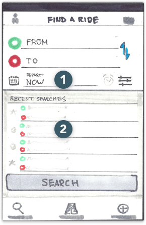
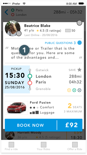
- Departure Date, Alert, and Filter moved to first screen
- Recent Searches now includes saved searches. Still only up to 5 rows.
- Driver preferences now become global filters; removed from individual cells.
- Cells are now single rows. Departure and Destination are removed as they are now more prominent in the header. Seats Left removed as well (moved to global filters for those users who need to specify).
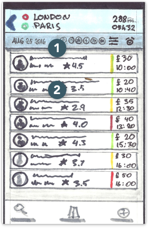
- Proximity of arrival city to user’s chosen destination, if not the same (new data).
- Not shown - driver statement/quote: Should be limited to 3 lines for this screen. Overall limit can be greater, but should exist as expandable content only.
- Departure Date set to “Now” by default; results would behave like they do in current app.
- Recent Search and Saved Search UI taken from Google Material Design.
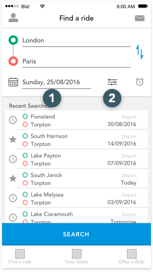
- User has selected a Departure Date (icon opens basic calendar picker UI).
- Filters - User has made a selection, so icon appears active.
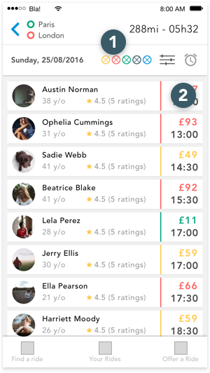
- Preference icons that were previously used in results. Each represents an active filter. Value-based filters (price, time) will not have any specific details with the icon.
- Price and time, grouped and more prominent.
- Arrival city, with distance to user’s destination.
- Driver statement / quote, reduced to 3 lines with option to view more (expands section).
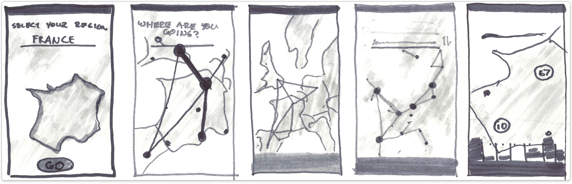
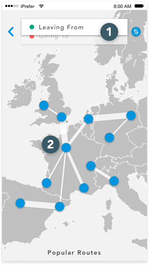
Goal: Allow user to explore and book through a non-linear progression of maps and visual references. All the original data is implemented.
- Intention is for the user to enter starting point first (visualization works better this way).
- Six most active/popular routes from origin. Can be recent searches (from any destination) as well.
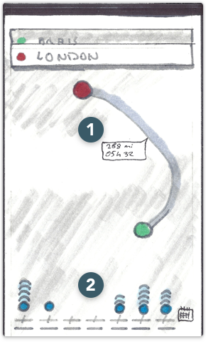
- Route is shown after user selects destination, with distance and time.
- Timeline of available rides; each column is a day, and icons signify the volume of travel along that route. Clicking one shows available drivers.
- Selected date of travel. Although user is guided to pick a date initially, it can be removed (and added again through Filters menu).
- Horizontal scrolling carouselle with driver pictures, name, rating price, and seats left.
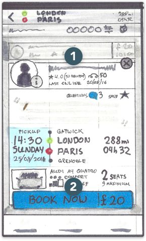
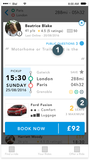
- Popup containing all information about the ride: Driver Info, Quote, Trip Description, and Car Info.
- Booking can be completed without ever going to a new screen.
- UI taken from Uber conveys which field user should enter first, without impeding them.
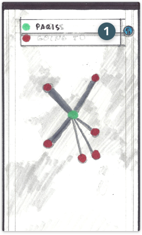
- Most popular routes in surrounding area. Ribbon width indicates relative number of rides. Tapping a pin auto-fills the search box “Leaving From” with that location.
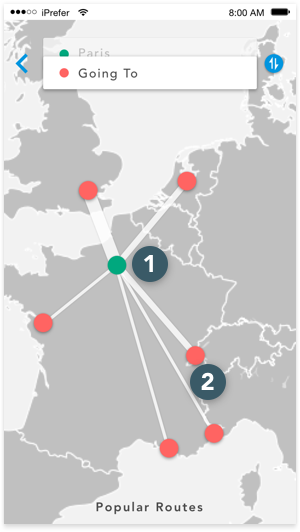
- User tapped a pin or entered location in search.
- Relative number of rides leaving the staring point is indicated by a wider ribbon. Tapping a red pin auto-fills the search box “Going To”.
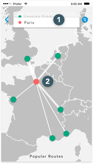
- User entered the destination first
- Now the map indicates rides going the destination from surrounding areas; again, number is representeed by ribbon width.
- To and From fields are now both active
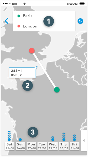
- Tool-tip with distance and duration of trip
- Upcoming week, with blue icons indicating relative number of rides on a given day.
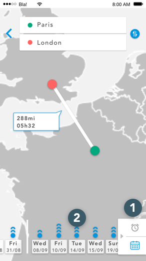
- If user scrolls the list of dates to the left, tray appears with Create Alert and Calendar icons. Selecting the calendar allows user to jump tp a specific date.
- After the first week days with no rides are skipped entirely. Tapping an icon shows available rides.
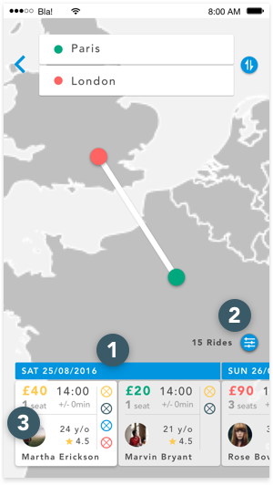
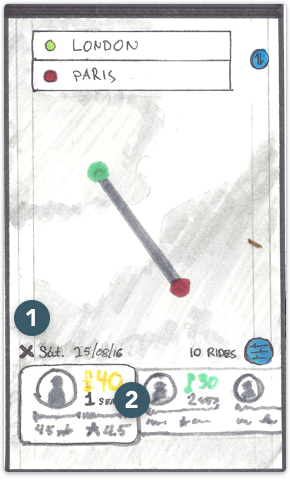
- Departure date and option to remove filter
- Exact number of rides (with current filters and selected date)
- Carouselle of available rides; tapping will launch booking popup
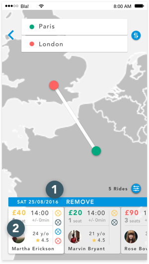
- User has removed date filter. Rides are segmented by date like in the current design.
- Left-most tab is “active” scrolling through the carouselle activates the next tab, which can affect the map.
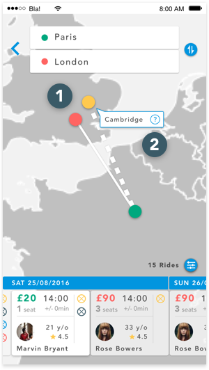
- User has scrolled to a ride which arrives near the user’s destination. The yellow pin shows driver’s arrival city, relative to red pin.
- Tool-tip shows city name and “more info” icon for distance
- Icon next to driver’s image opens their profile page with all verification and ID information.