EHR Case Study
UX / UI, User Research, Process Flow, Wireframing, Sketch, Pen & Paper
July 2016
What is it?
NTMS (Nurse Task Management System) is a dynamic “to-do” list for nurses. It integrates with a hospital’s EHR database, thereby functioning as an unobtrusive, single point of reference to keep track of and update only relevant records.
My Role
This was a solo project, as part of the UX design course at General Assembly. The idea came from my interest in healthcare UX, and inspired by my first-hand experience in clinical research and hospitals.
Purpose
Nurses spend 19-35% of their time performing documentation; EMRs systems have sped up the process by up to 45% However, perception of time spent documenting has increased.
Why?
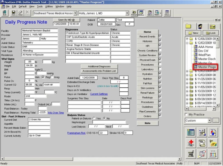
Perhaps because typical EMR’s still look like this…
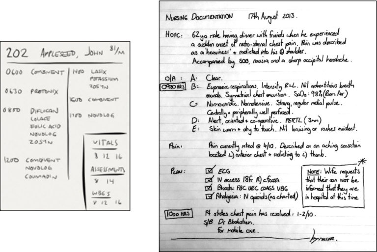
…and “Task Management Systems” look like this
Solution
Consolidate the capabilities and advantages of paper note-taking, alternative calendar/schedule apps, and data-driven hospital EMRs into one system on the back-end, while minimizing necessary user input on the front-end.
The goal was to present only the most relevant, time-sensitive information upfront and all possible actions to be taken from either the home screen or patient page. The entire app consists of these two pages – home screen and patient screens – with actionable information presented in context-oriented, collapsible side-drawers
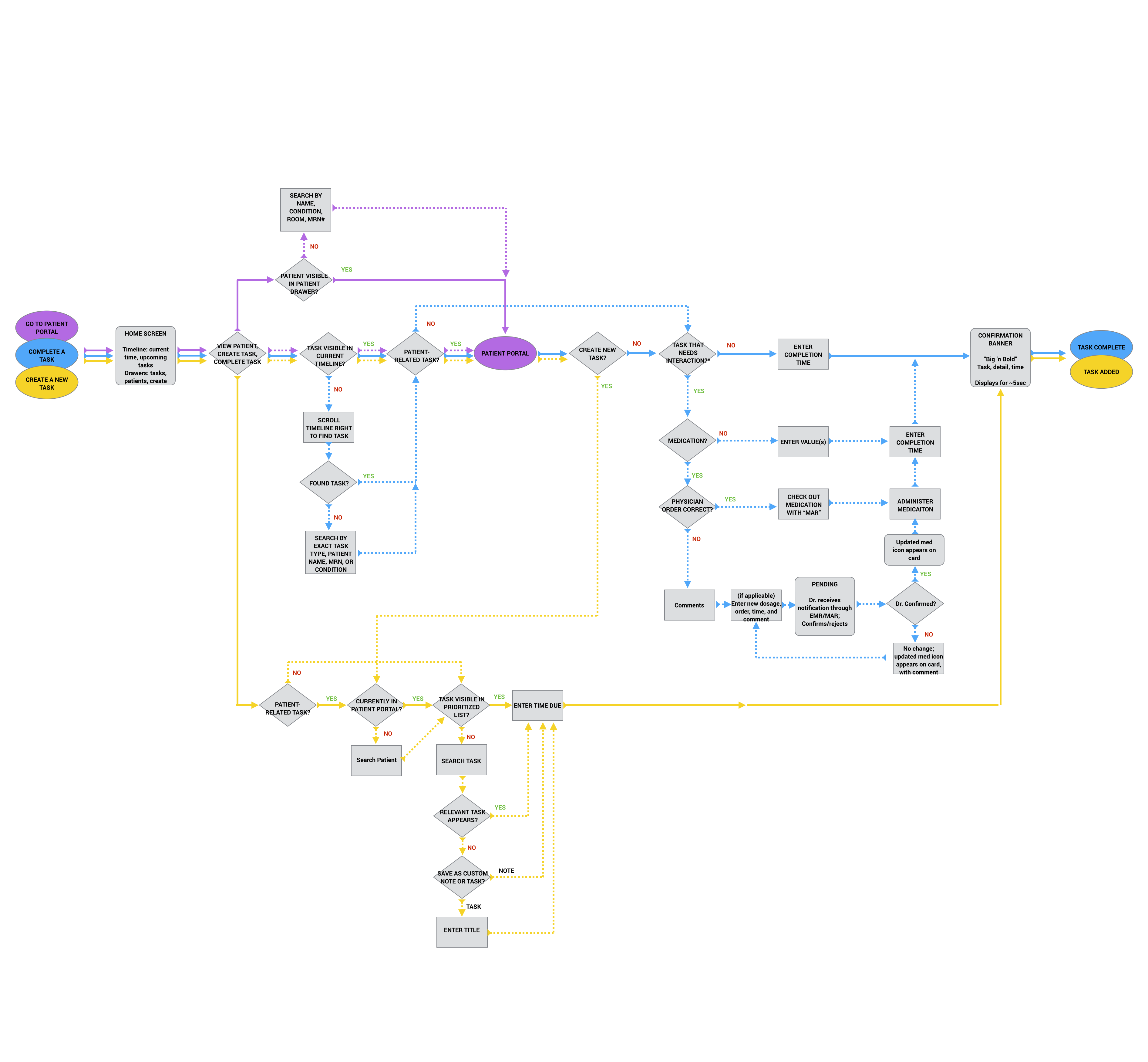
Full User Flow
Mockups
Mockups for the app were designed using Sketch, Photoshop, and ultimately transfered to Invision for prototyping. Visual guidelines for UI best practices were used to delineate elements, and where colors had to be chosen, they were sleected from an array of maximally dissimilar values. Affordances were designed to be responsive to the most crude and basic gestures, envisioning the possibility of a user wearing gloves and using the app in a non-ideal scenario.
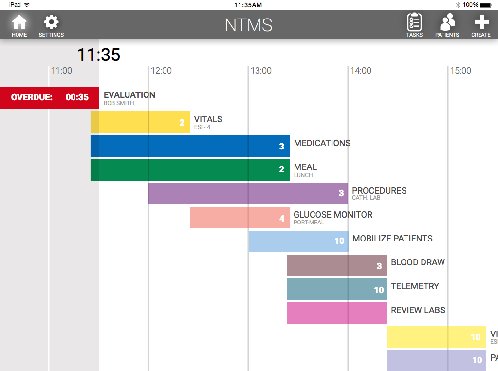
Home Screen
A graphic schedule allows nurses to quickly gauge and prioritize their workload directly from the home screen. Each stripe employs maximally dissimilar color values, and represents a “group” of potential tasks, represented as hospital “rounds”. The specificity for this definition was gathered from interviews with care providers
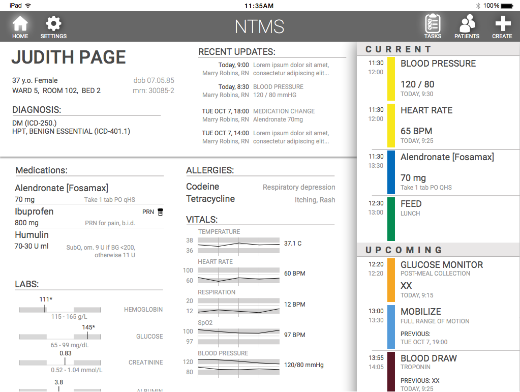
Patient Page
Each patient profile displays typical EHR content, in a progressively disclosed manner relevant to the task being worked on. Drawer on the right displays only tasks pertinent to this patient, as opposed to all tasks for all patients when on home screen.
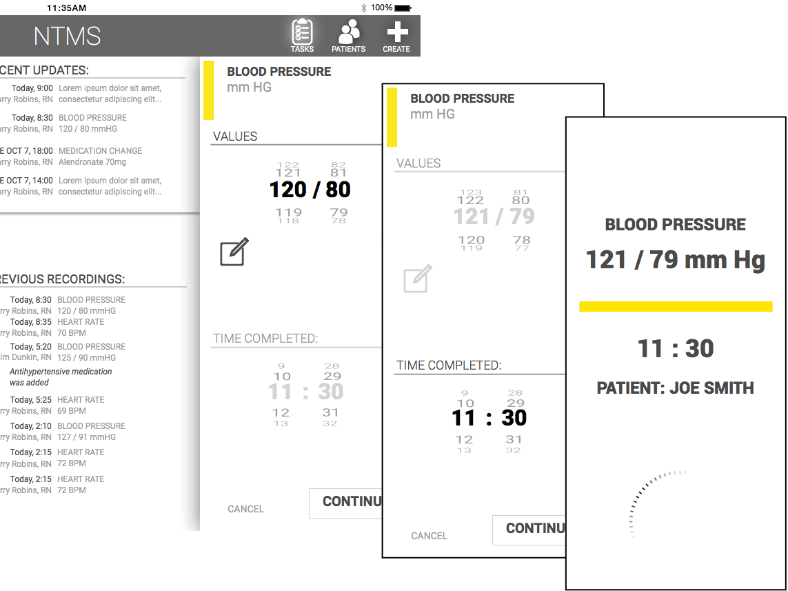
Completing a Task
Entering a value simultaneously updates the hospital record, and “completes” a task – no need for check-boxes.
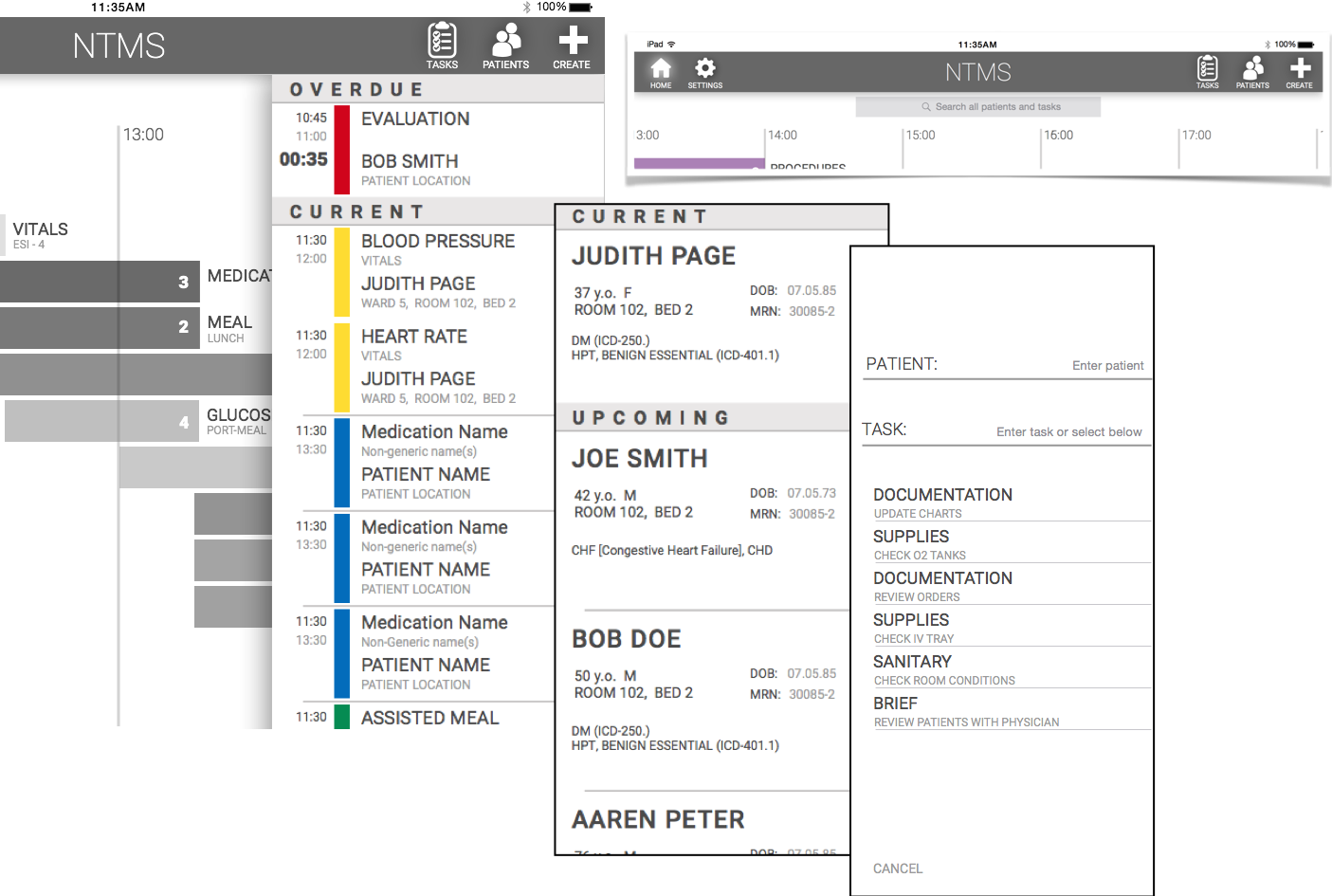
Drawers and Navigation
From home menu, user can access the individual task list, patient list, and option to add patient/task. Search appears only in home, when user begins to drag the graphic schedule (i.e.: search behavior). This allows multiple points of access, depending on the scenario.